Color Wheel - Find Your Color Combination
Do you want to know which colors look nice together? Crafty Art Color Wheel can help you easily find color combinations.
What is a Color Wheel?
A color wheel is a circular diagram that organizes colors based on their chromatic relationship, providing a visual representation of the color spectrum. It serves as a fundamental tool for artists, designers, and anyone working with color, aiding in the understanding of color theory and its applications.
The wheel typically consists of 12 colors, with primary colors (red, blue, and yellow) spaced evenly around the circumference. Secondary colors (green, orange, and purple) are derived by mixing adjacent primary colors, while tertiary colors result from combining a primary color with its neighbouring secondary color. This arrangement creates a harmonious flow of colors, demonstrating their relationships and facilitating the selection of complementary, analogous, or triadic color schemes.
The color wheel is grounded in the principles of color theory, a conceptual framework that explores how colors interact and influence each other. It provides a visual guide for artists and designers to create aesthetically pleasing compositions and convey specific emotions or messages through color choices. The wheel is often accompanied by terms such as hue, saturation, and brightness, which further refine the understanding of color properties.
Color combinations
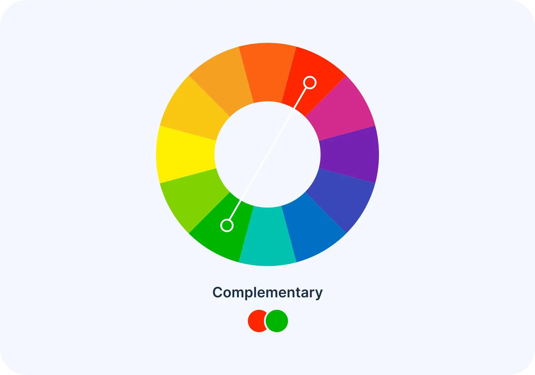
Complementary
Two colors that are on opposite sides of the color wheel. This combination provides a high contrast and high impact color combination – together, these colors will appear brighter and more prominent.
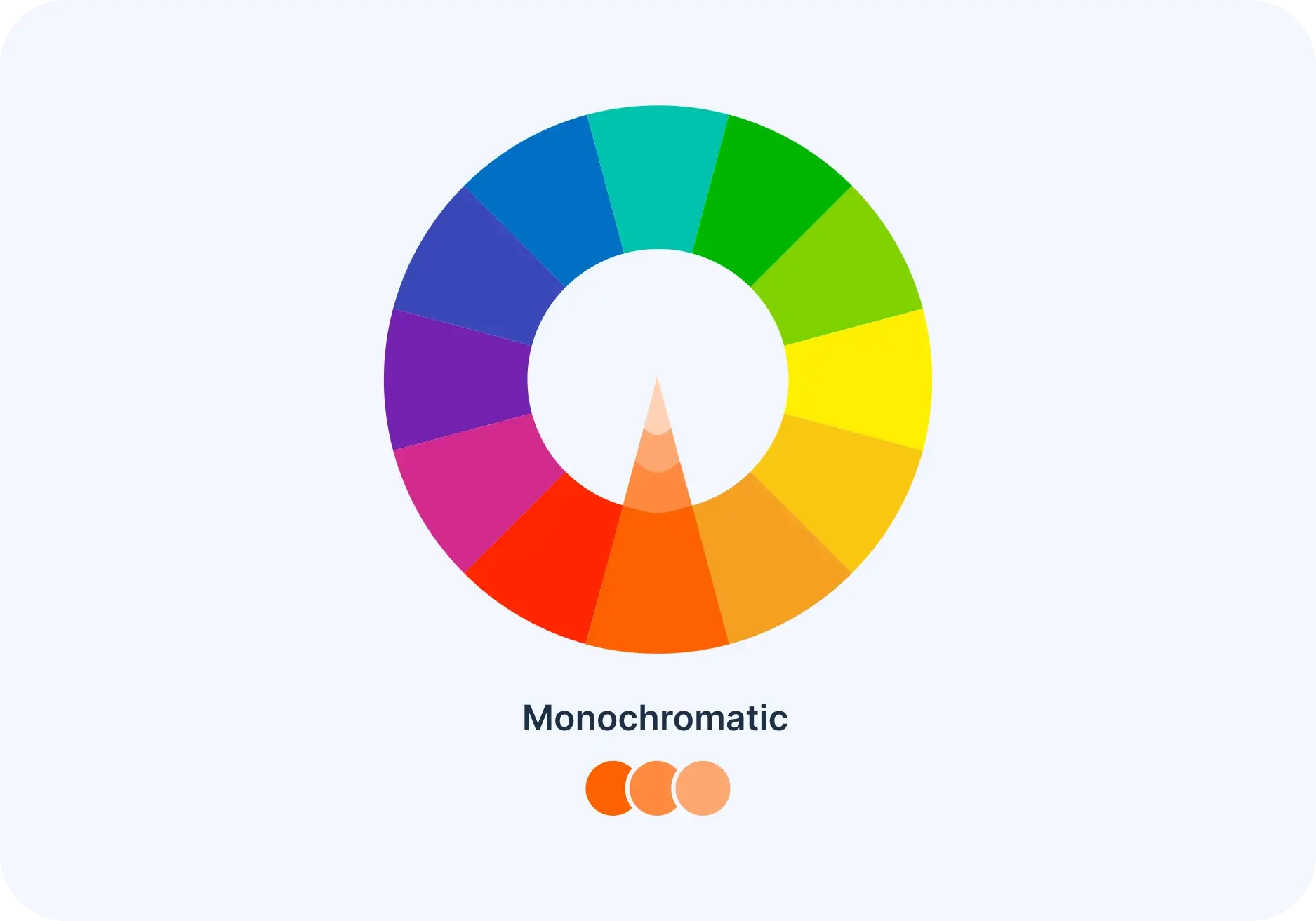
Monochromatic
Three different versions of a single color - darker, lighter, and in-between. Together,they create a calm and traditional mix of colors. This combination is easy to use in designs and gives a balanced and pleasing appearance.
Analogous
Three colors that are next to each other on the color wheel work well together.This combo is flexible but might be too much if overused. To keep it balanced,pick one main color and use the others as smaller details.

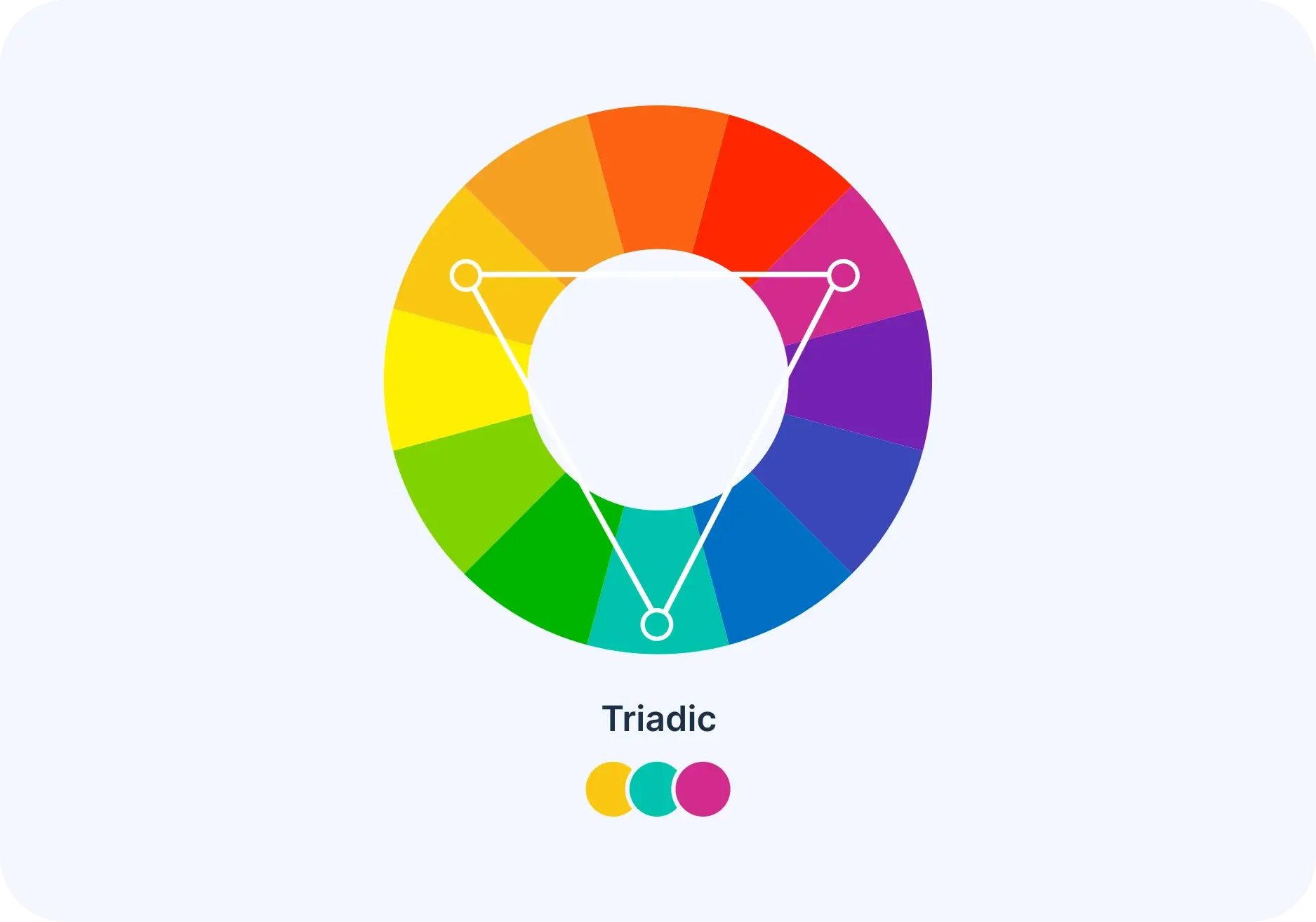
Triadic
Select three colors that are evenly distributed around the color wheel. These colors offer a robust contrast without being as intense as complementary colors. They are versatile and can create vibrant and dynamic combinations.
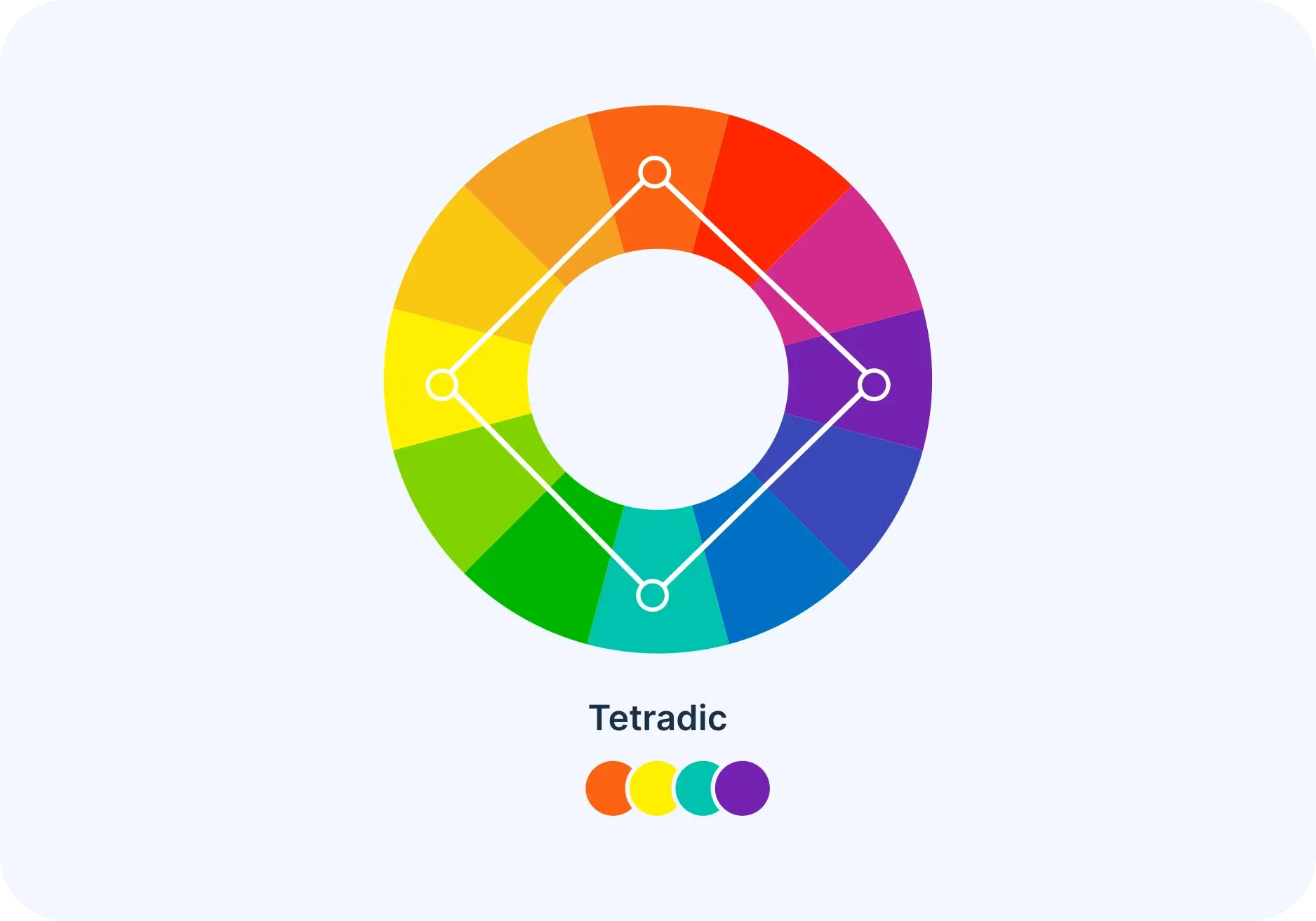
Tetradic
Four colors that are equally spread out on a color wheel. Tetradic color schemes are bold and work best if you have one main color and use the others as highlights. It's harder to balance your palette with more colors.
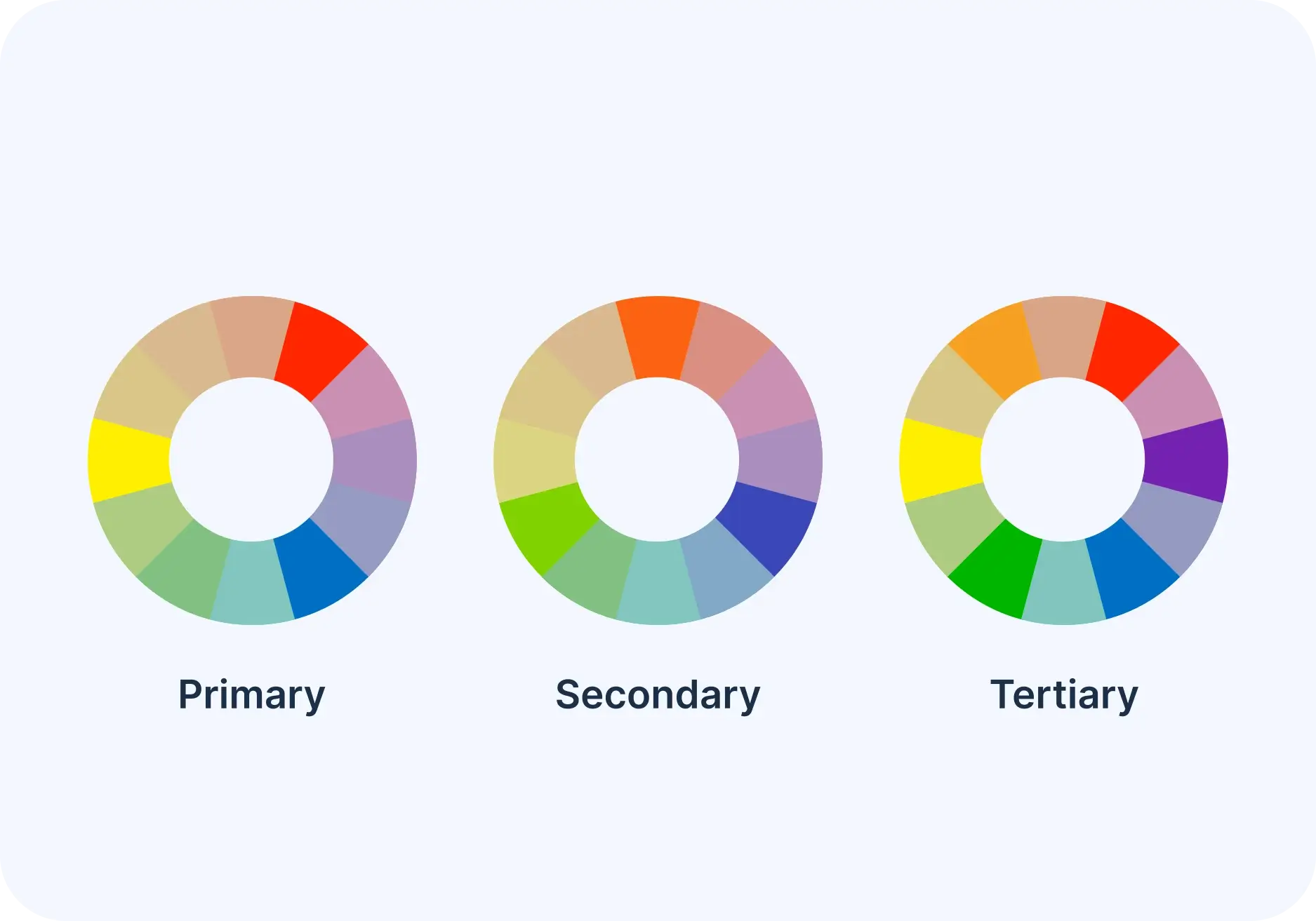
Primary, secondary and tertiary colors
On the RGB color wheel, there are 12 main colors. These colors are red, orange,yellow, green, blue, violet, magenta, rose, and some shades in between like chartreuse green, spring green, cyan, and azure.
The color wheel has three main groups: primary, secondary, and tertiary colors.
The primary colors in the RGB color wheel are like the building blocks of light. When you mix them together, they create white light. These special colors are red, green, and blue.
Secondary colors are created by mixing two main colors together. There are three secondary colors: cyan, magenta, and yellow. In the RGB color system, mixing light shows that red and green make yellow, green and blue make cyan,and blue and red make magenta.
Tertiary colors are made by mixing a secondary color with a primary color. Six tertiary colors are present. blue, violet, orange, rose, spring green, and yellow.
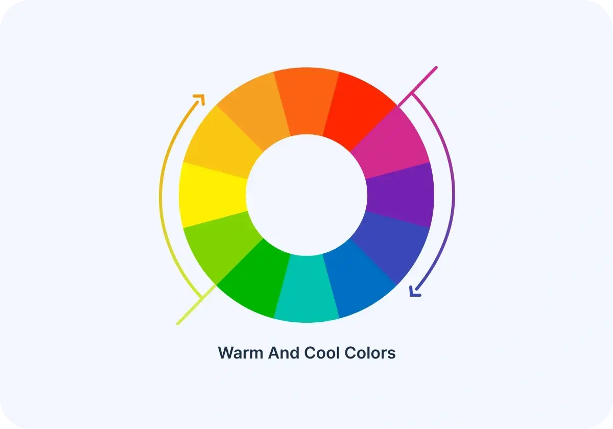
Warm and cool colors
The color wheel can be divided into warm and cool colors. Warmth or coolness of a color is called its color temperature. Color combinations on the wheel usually mix warm and cool colors in a balanced way. In color psychology, warm colors make us think of comfort and energy, while cool colors bring a feeling of calmness and being alone.
Warm colors are colors like red, orange, and yellow. They remind us of warmth, like the sun.
Cool colors like blue, green, and purple make us think of cool things like water.
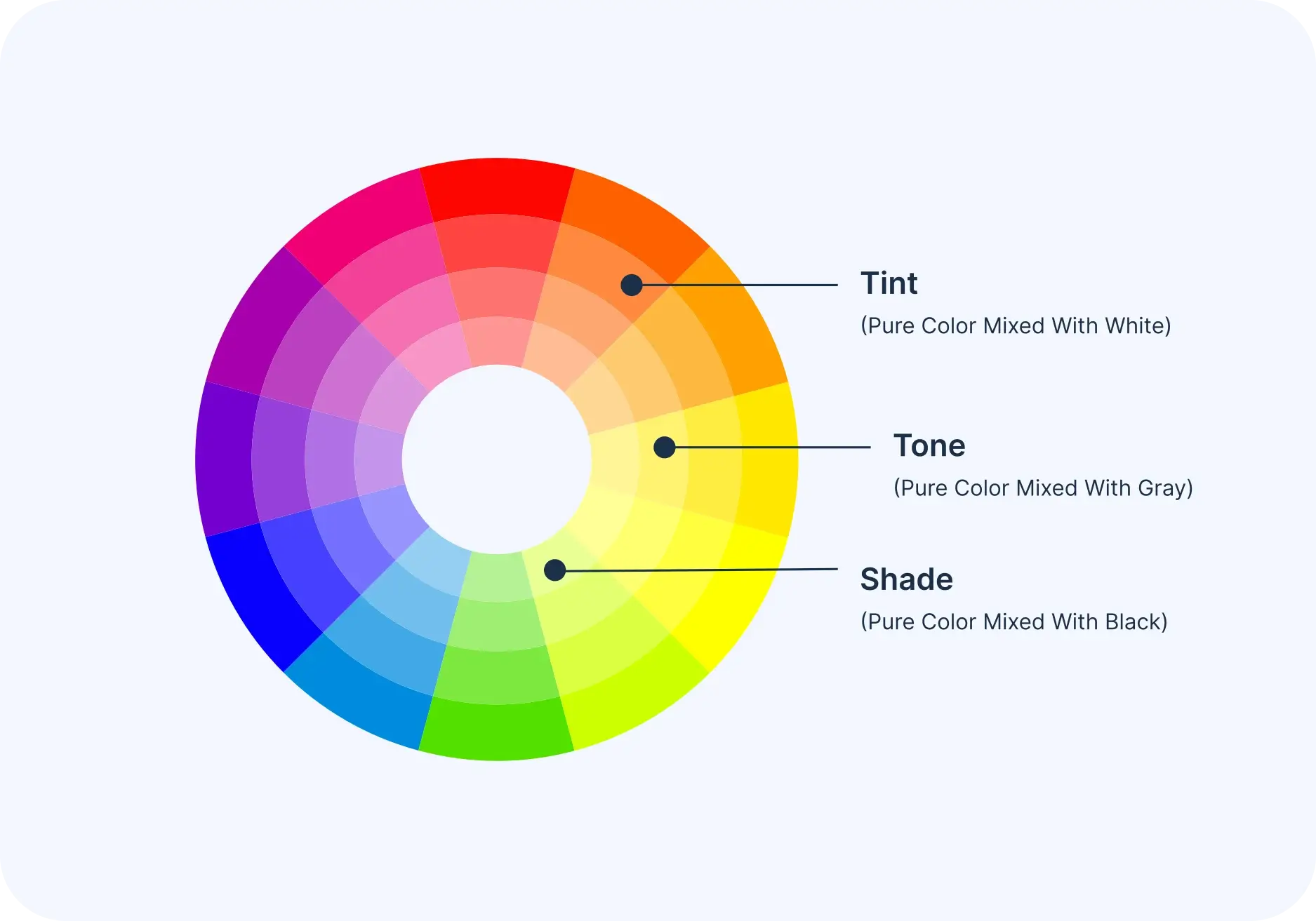
Shades, tints and tones
You can make different versions of a color by mixing it with black, grey, or white.
Shade
When you add black to a color, it becomes darker and richer, creating a shade. Shades can be strong and may dominate.
Tint
A tint is made by mixing white with a color to make it lighter. It softens the color and can help balance bright color combinations.
Tones
A tone is made by mixing black, white, or gray with a color. It's like making a softer version of that color. Tones aren't as bright as tints and can show different details in the original color.
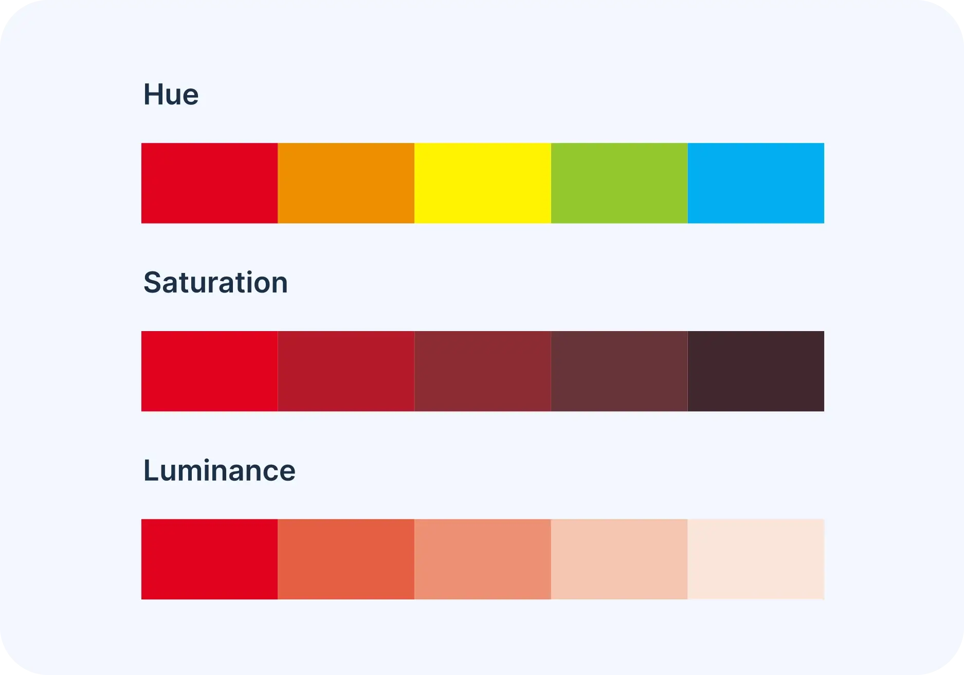
Hue, Saturation and Luminance
Shade
Saturation means how bright and strong a color looks.
Luminance
is how bright or light a color looks.
Pick a Color
Choose a color combination
Create Stunning Designs with This Perfect Color Palette!
At Crafty Art, bring your creative vision to life by using this thoughtfully curated color palette that adds elegance, harmony, and visual appeal to every design you craft.
What are Customers Saying about Crafty Art
Crafty Art has a proven track record of delivering efficiency, results and excellent customer service.
Emily Smith
“As a photographer, I rely on Crafty Art Background Remover to quickly separate subjects from their backgrounds. It's fast, accurate, and has saved me a ton of time. Highly recommended”
James Johnson
“Crafty Art is a fantastic online caricature tool for creating unique invitations. Its user-friendly interface make easy to design personalized caricatures that bring fun and humor in to my event. With excellent customer support and quick delivery, I prefer to design Caricature invitations with Crafty Art!”
Olivia Davis
“The custom invitations from Crafty Art exceeded my expectations. Their user-friendly graphic design tools made it easy to create a unique design. The quality and design of the invitation card were outstanding, and their customer service was top-notch. Quick delivery and attention to detail set Crafty Art apart. They made my event extra special!”
Pooja Sharma
“The invitation maker tool from Crafty Art is perfect for those last-minute invitations. I used it for a surprise party and had invitations ready within an hour. The templates are so stylish, and you can quickly personalize them with the event details. The speed at which I could create and print the invitations saved the day for me.”
Ethan Wilson
“Crafty Art Graphic Design Tool has been a game-changer for my design projects. Here a reasons why Crafty Art has earned my trust and loyalty: User Feedback Integration, Cross-Platform Compatibility, Time-Saving Features, Regular Content Updates, Security and Privacy, Advanced Export Options and Many More…”
Sophia Brown
“I run a small business, and the Crafty Art Daily Post Maker has transformed the way I handle my social media marketing. With this tool, I can easily schedule posts in advance, ensuring a consistent online presence for my brand. The convenience it offers is incredible. It has allowed me to grow my online following and connect with my customers in a more meaningful way.”
Siddharth Reddy
“I recently had the pleasure of using the Crafty Art Invitation Card Maker Tool for an upcoming special event, and I couldn't be more delighted with the results. This online platform has truly transformed the way I create invitations, making the process both fun and effortless.”
Kevin Smith
“The invitation maker tool from Crafty Art is so versatile. I used it for a baby shower invitation, and it allowed me to add personal photos and text. The final product looked professional and heartwarming. Being able to incorporate pictures of the mom-to-be made the invitation extra special.”
Devid Johnson
“Crafty Art Logo Maker is a fantastic online tool! I am able to design a stunning logo for my small business in less time. its user-friendly interface and a wide range of logo designs make the process very easy. I impress with the simplicity of the platform, which allowed me to review with various design elements, colors, and fonts until I found the perfect logo that represented my business.”
Sophia Devis
“Crafty Art Flyer Maker is a great tool for quick and easy flyer design. The only downside is the limited export options. I'd love to have more file format choices for my designs, but it's still a solid choice for businesses on a budget.”
Have more Questions?
See our help center or send us a message!

FAQs for Color Wheel
1. What is a color wheel, and why is it important in design?
2. How do I use the color wheel to pick colors for my project?
3. What are complementary colors on the color wheel?
4. What’s the difference between warm and cool colors on the color wheel?
5. Can I use the color wheel for digital design projects?
Features
Create Invitation
Create Video Invitation
Wedding
Baby Shower
Birthday
Puja
Funeral
Naming Ceremony
Gender Reveal
Inauguration
Engagement
Stationery Design
Caricature Maker New
AI Tools New
Company
Legal